
Direction · 1 of 7
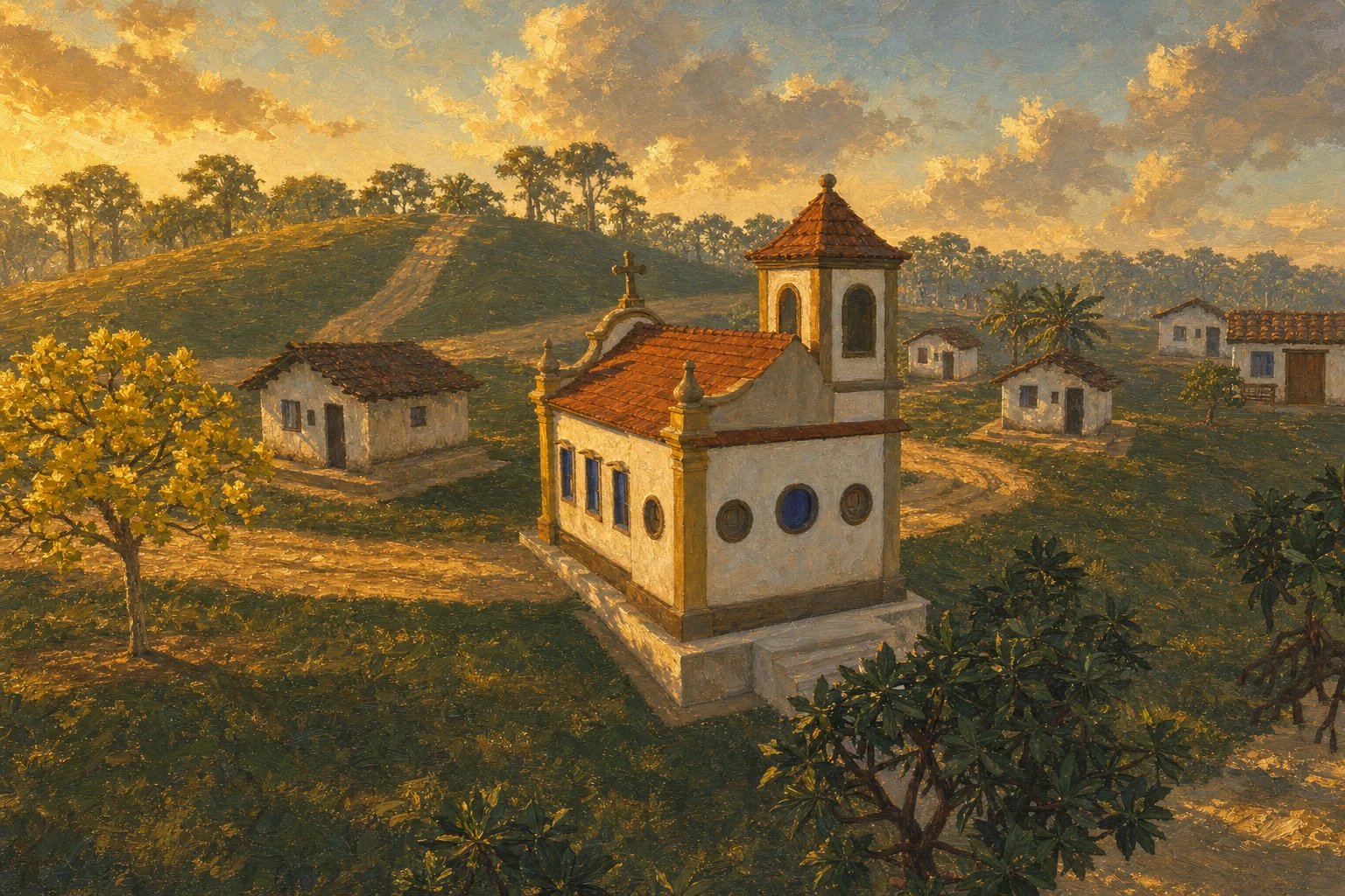
The frame is gold, the background is the real valley, and nothing adorns what is already beautiful.
The 3D game interface follows the "Crônica do Recôncavo" identity chosen on September 28, 2026: a gilded carved altarpiece with a cobalt tile border over dark green lacquer, Cinzel small-cap plaques, Cormorant Garamond body text, compass roses marking the focused item and painted valley covers (by day, sunset with the church and saveiro; by night, the traveler with a lantern at the woodland edge). The menu uses the LTX painted flyover video, preserving the gilded carved altarpiece. The playable scenery loads only on entering the valley; the video background reduces entry costs.
The 2D game, the older sibling and the reference for the rules, has its own pixel-art visual direction: the same golden-hour palette of the Recôncavo, a two-plane view for every building (the whole facade from the front and the whole roof laid flat above it), a numeric gate that measures each piece before accepting it and the rule that all art that cost credits is kept. Both directions apply at the same time: the 3D's governs what the player sees on the valley screen; the 2D's governs the interface icons the 3D borrows (backpack items, web nodes, village portraits) and everything still drawn for the 2D game.
Visual direction
The frame is gold, the background is the real valley, and nothing adorns what is already beautiful.
The 3D game interface follows the "Crônica do Recôncavo" identity chosen on September 28, 2026: a gilded carved altarpiece with a cobalt tile border over dark green lacquer, Cinzel small-cap plaques, Cormorant Garamond body text, compass roses marking the focused item and painted valley covers (by day, sunset with the church and saveiro; by night, the traveler with a lantern at the woodland edge). The menu uses the LTX painted flyover video, preserving the gilded carved altarpiece. The playable scenery loads only on entering the valley; the video background reduces entry costs.
The 2D game, the older sibling and the reference for the rules, has its own pixel-art visual direction: the same golden-hour palette of the Recôncavo, a two-plane view for every building (the whole facade from the front and the whole roof laid flat above it), a numeric gate that measures each piece before accepting it and the rule that all art that cost credits is kept. Both directions apply at the same time: the 3D's governs what the player sees on the valley screen; the 2D's governs the interface icons the 3D borrows (backpack items, web nodes, village portraits) and everything still drawn for the 2D game.
10 principles
What is not negotiable
Chronicle of the Recôncavo: gilded carving, lacquer and azulejo
The identity has fixed colors, fonts and pieces, shared by the loading screen, menu and HUD from a single module: gold #e8c46a, cream #f6ead0, cobalt #1d3f8f, dark green lacquer, terracotta #e39475; a gilded carved frame in NinePatch, 1 px gold fillets, an azulejo lozenge, additive glows and a discreet gold thread along the bottom. The home panel and every modal (SETTINGS, ABOUT, Changelog, MODELS, map) get the same frame; buttons become Cinzel plaques with beveled corners.
The scenery is the main illustration
The opening shows the real 3D scenery, with no background sprites, and the interface leaves room for it: the altarpiece (retábulo) covers the left side, and the flyover's visual axis sets the gaze ahead at 75% of the window width, in the free right third. In 2D the rule is the same: the existing scenery is the main illustration; interface and motion must leave room for it, with no portal header, slogan or geographic signature over the landscape.
Two fonts, one verb per button
Cinzel for actions and titles, Cormorant Garamond for body text (with italics for quotations and oldstyle figures for versions, times and percentages). Menu buttons use a single uppercase word: PLAY, EXPLORE, MODELS, ABOUT and QUIT; settings and the map stay in the corner icons. In the crossing, CONTINUE and SKIP are set in small caps, without a box. Almendra and Miva, the 2D fonts, remain available as a "Menu font" option, but "Crônica" is the default.
Gold marks edges, focus and brand; cobalt is a rare detail
Gold is used on edges, fillets, focus and the carved logo; it does not cover the screen. Compass roses spin at the ends of the focused item (hovering the mouse already gives focus: a single marker). Cobalt azulejo appears as a thread in the frame, as a divider and as lozenges in the corners. In 2D, the same hierarchy: dark ink #111a19 on panels, aged gold #c8a568 for focus and thin outlines, parchment #eee4cc for text, sage #7e9584 for secondary text, and copper #d29450 only for small accents.
Restrained motion, no decorative particles
The logo animation changes only brightness: it moves neither letters nor scenery. The opening no longer overlays golden dust and fireflies on the scenery, and the loading screen has no particles and no sound before the menu appears. Background videos and images keep uniform scale and a centered crop; anyone who turns on the reduced-motion preference sees the still image.
The cover follows the valley's hour
The loading screen is the painted cover of the valley filling the screen with a slow camera move, the gilded carved logo, a note from the almanac, the current step with a percentage, the spinning compass rose and a gold thread as the progress bar. By day, it's the sunset with the church and the saveiro; by night, the traveler with a lantern at the edge of the woods (the night cover comes in mirrored). Entering the game uses the hour at which it starts; returning to the menu uses the current hour; and the clock waits for the valley to finish building so the player arrives at exactly the hour that chose the cover.
In 2D, two planes and nothing more
In a 2D building, the player sees the whole façade head-on and the whole roof laid back above it. Side walls don't exist in this view; the ridge is horizontal; a piece that is symmetrical in the world has a symmetrical silhouette on screen; the roof is half the drawing, not a frieze. Three planes is isometric, a single plane is a stage flat — the genre takes two.
A gate before accepting: measure, don't guess
Every 2D building goes through two measurements before it gets in: silhouette symmetry (92% cutoff) and ridge width at 20% of the painted height (75% cutoff). A new piece below the cutoff fails on the spot; old debt stays declared in a queue that shows up every run without failing it. The gate went into the generation loop itself: each attempt is measured, passes both or tries another seed, and a failed symmetry never replaces a passing one.
Ask by affirmation, in few words
No negation in the prompt: you describe what is seen, not what isn't. Ask for "wide", never "long" (an invitation to rotate the piece); the word "gable" is poison because it names the wrong geometry; sixty words drown the rule — the pieces that pass best have thirty and mention the roof first; "seen from above" with a high camera is the recipe for the best piece in the catalog. Lettering comes out wrong from the generator: the sign is left blank and the text goes in inside the game.
Nothing that cost credits is deleted
All generated art is saved automatically to the vault the moment it arrives from the API, with date, destination, seed and the description that produced it — including the variants not chosen, which are the most expensive to redo because the same seed doesn't return the same drawing. When what you want is the broken state of art that already exists (the collapsed bridge, the collapsed lookout), destroying it in code beats generating again: it's free, matches the palette and is visibly the same piece.
11 rules
In practice, day to day
- Identity colors: OURO #e8c46a, CREME #f6ead0, COBALTO #1d3f8f, ROTULO #e2c170, TEXTO #f6eedb, LACA rgb(0.082, 0.129, 0.106), TERRACOTA #e39475.
- Fonts: Cinzel-Variavel.ttf (titles and actions), CormorantGaramond-Variavel.ttf and its italic (body), both under the OFL license; oldstyle figures (the 'onum' feature) for versions, times and percentages.
- Carved frame (moldura_retabulo.png, 994×1502): NinePatch with margins 140/150/140/160 and scale 0.3, extending 12 px beyond the box it frames.
- Plaque buttons: Cinzel on dark green lacquer with a gold border and beveled corners; hover lights up the border; SAIR uses the inverted variant.
- The place-and-period line appears once, between fillets, at the top of the altarpiece ("Bom Jesus dos Pobres · 1887"); the historical context guides the setting and lives in the documentation — it doesn't become a label scattered across the interface.
- ABOUT and the information panels speak in public language: file paths, production tools, comparisons between versions and implementation notes stay in the documentation, out of the interface.
- Identity pieces in assets/prototipo_3d/identidade/: logo_myths_valley.png (1496×431), capa_dia.webp and capa_noite.webp (2048×1152), rosa_dos_ventos.png (512×512), moldura_retabulo.png; generated with gpt-image-2 on 09/28–29/2026, originals and prompts kept out of Git; check the current commercial-use terms before publishing.
- Scenery palette: whitewash #F2EAD8, roof tile #A8442F, packed clay #8A6A44, forest green #3E6B34, new green #7FA64B, dry ochre #C8A052, tide blue #3E7B8C, navy blue #22304A, wine #6E2233, brass #C8922E. No neon, pure cyan, saturated purple or lime green; myth and the supernatural come in only in luminous sapphire blue.
- In 2D, every piece is requested with its foot at the bottom center of the image (the 32×48 tile sits on the ground and overflows upward); minimum accepted size 32×32; 'map-objects' is the right endpoint for scenery and buildings (it charges one generation for any size).
- In 2D, the view text lives in a single place and is loaded by every generation script; '-Apenas <nome>' fixes one piece without paying for the batch; the seed is a parameter ('-Deslocamento').
- 2D panels, buttons and cards use PixelLab atlas pieces in nine-slice, preserving the ornamental corners; no generic rounded boxes.
Where it shows up
- Loading screen (tela_carregamento.gd)
Painted cover in slow motion, carved logo with the place and year between gold fillets at the top left, an almanac note (facts by day, valley sayings by night), the step with a percentage, the spinning compass rose and the gold thread as the bar; a minimum of 1.1 s per step so the text is readable. - "Retábulo" home (abertura.gd)
Panel with a carved frame, a painted logo with a breathing halo, the line "Bom Jesus dos Pobres · 1887", the motto and the azulejo divider; plaques with short text; compass roses turning at the ends of the focused plaque; the inner footer follows the published version and opens the history. - A cinematic crossing
The nine lines of JOGAR in black letterbox bars, the chapter between lozenges, a Cormorant caption centered at the bottom over the valley, and the gold thread timing each line. - Painted covers (capa_dia.webp, capa_noite.webp)
The church on the covers was described from the game's model: whitewashed, an ochre dado, a scrolled pediment with an oculus, a blue door and a tower with a clay-tile roof. - The 2D general store and fishing hut
The general store went from 84.0% to 96.9% symmetry in three generations (two of them to get the channel tiles and the counter right); the fishing hut came out crooked when asked for "stairs climbing to the door" and reached 100% with "steps in front". - The 2D lookout
Four generations: "four posts" made the generator put two at the back; "tall and narrow" beat the framing; what solved it was changing the noun — it's not a "watchtower on stilts", it's a "wide raised timber deck" (81×111 px, 96.2%). Pedro's line already said what the piece is: "The posts stayed. It's the planking that gave way." - The 2D collapsed bridge
Asked of the generator twice, it came back whole and in perspective. It was made by breaking apart, in code, the art of the standing bridge: it opens the gap, makes the stumps sag, splinters the break and scatters loose planks — and it's visibly the same bridge the player rebuilds later.
Where it comes from
The documents behind this area
- Opening and audio — the crossing, the pier arrival and the opening sound
- 3D changelog — what changed in each build
- The living valley — day and night, residents and the valley's sound
- In-game identity — colors, fonts and pieces of the Recôncavo Chronicle
- Interface theme — menu, dialogs and HUD in one identity
- Identity origin — where the logo and visual pieces come from
- Opening visual direction — the 1887 Recôncavo on the first screen (2D)
- The valley view — how each 2D world piece is drawn
- Art with PixelLab — how the 2D art is generated
- Setting — where, when and the valley's palette